How Does Color Psychology Affect Vending Design?
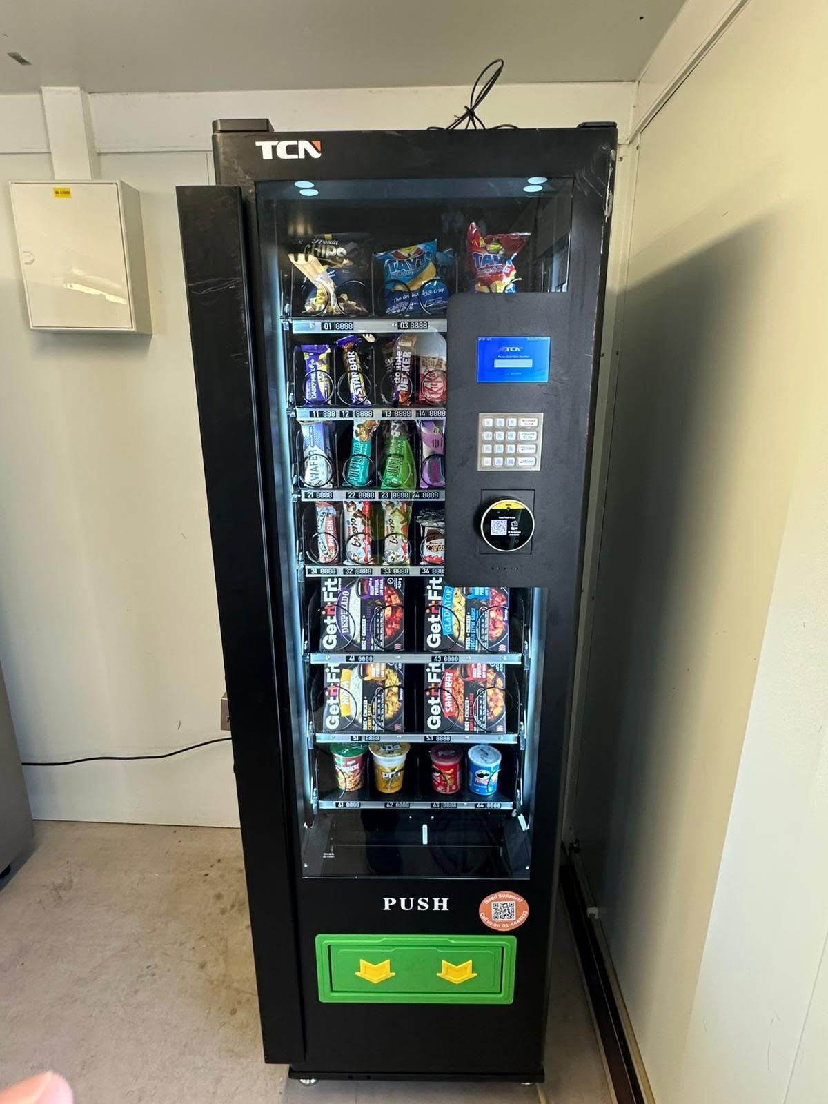
Color plays a bigger role in buying decisions than many people realize. People often react to colors before they even notice products. As a result, the right color choices can capture attention, build trust, and create a positive shopping experience. This is why vending design should always consider color psychology. A well planned machine can attract more users while making product selection easier and more enjoyable. In addition, the right color combinations can improve product visibility and help customers find what they want faster. Therefore, businesses that invest in thoughtful vending design often create a more welcoming environment, encourage repeat purchases, and leave a stronger, more memorable impression on customers.
Why Vending Design Starts With Smart Color Choices
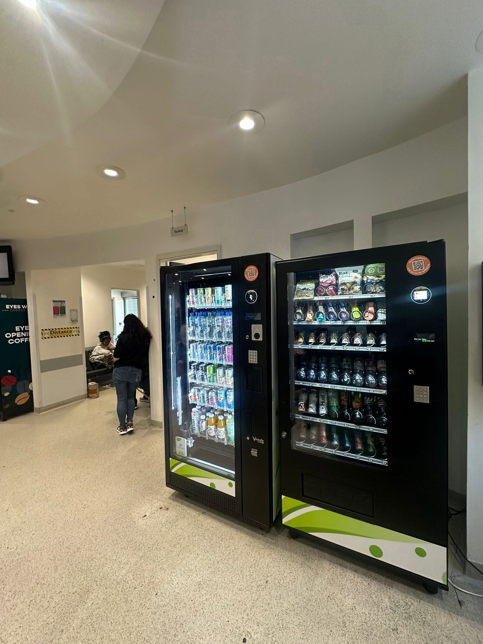
The first impression of a vending machine happens within seconds. Therefore, colors should immediately communicate cleanliness, quality, and convenience. Bright colors can attract attention in busy locations, while softer tones can create a calm and welcoming appearance. In addition, matching colors with the products inside helps customers understand what the machine offers. Effective vending design begins with these simple but important visual decisions. Furthermore, consistent color schemes make machines look more professional and easier to recognize. Customers also feel more confident when displays appear organized and visually appealing. As a result, thoughtful color selection can increase engagement, improve the overall user experience, and encourage more people to make a purchase.
How Vending Design Uses Color to Influence Buying Decisions
Different colors often create different emotional responses. For example, red can encourage quick decisions, while blue can suggest reliability and trust. Likewise, green is commonly linked with freshness and healthier choices. Because of this, thoughtful vending design can guide customer behavior without using extra signs or promotions. However, colors should always support the products instead of overwhelming the display.
Why Consistency Matters in Vending Design
Consistency creates familiarity, and familiar experiences build confidence. Therefore, every part of the machine should follow the same color theme, including buttons, payment areas, and product displays. Clear color contrast also improves readability and helps customers complete purchases more quickly. If you are planning a new machine layout, resources from vending-machines.ie can provide useful ideas for creating an attractive and practical vending solution. As a result, customers enjoy a smoother buying experience from start to finish.
Balancing Attraction and Functionality
Although bright colors can capture attention, too many competing colors may confuse customers. Instead, balance is the key to successful vending design. Neutral backgrounds often make products stand out more clearly. Meanwhile, accent colors can highlight special offers or popular items. Furthermore, proper lighting works together with color to improve visibility and encourage purchases throughout the day.
Using Color Psychology for Long Term Success
Color psychology is not about following trends. Instead, it focuses on understanding customer expectations and creating comfortable experiences. Businesses should also review customer feedback and observe buying patterns after updating machine colors. Small adjustments often produce meaningful improvements over time. Most importantly, successful vending design combines attractive colors with simple navigation and clear product presentation. If you would like expert guidance on creating machines that attract more customers, contact us to learn how we can help improve your vending solutions.