
Micro-Market Notices: Keep Payment Instructions Separate from Promotions
A micro-market can accumulate notices as new products, offers and workplace messages are introduced. If everything competes for attention around the checkout, customers may struggle to find the instructions needed to complete a purchase. Keep essential payment guidance distinct from promotional messages and review the arrangement as the service changes.
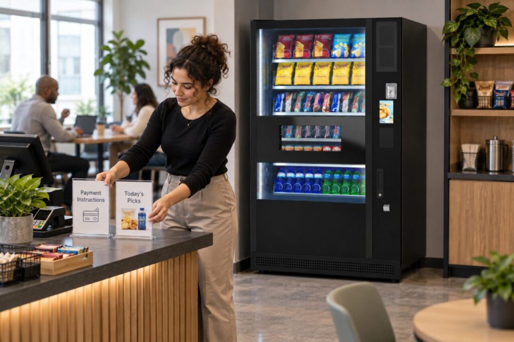
The correct wording and placement depend on the supplied checkout and the site’s layout. Ask the provider which instructions are required and where supplementary notices can be placed. Do not cover equipment information or invent a universal payment sequence based on another market’s display.
Identify the essential information
List the customer actions that need explanation for the installed arrangement. These might include adding items, reviewing the basket or getting help, but use the provider’s confirmed process. Keep the instruction set focused on completing the purchase rather than mixing it with a long explanation of the workplace’s wider refreshment policy.
Check whether the equipment already displays some of the information. A duplicate notice can help in some settings, but conflicting versions create uncertainty. If the wording differs, ask the provider which version should be used and remove outdated supplementary guidance through the site’s normal approval process.
Give promotions a separate place
Use a clearly distinct location or format for optional product messages, where the provider and site approve it. Customers should be able to identify the payment guidance without reading every offer. Avoid presenting a promotional statement in a way that looks like a mandatory step in the transaction.
Check that any offer actually applies to the supplied system and products. Do not advertise a bundle, discount or special payment method unless the arrangement supports it and the responsible provider has confirmed the terms. A printed card does not create a feature that the checkout cannot deliver.
Review the view from the customer
Walk the purchase journey with someone unfamiliar with the layout where practical. Ask which notice they use to understand payment and where they would look for help. Keep the exercise voluntary and focused on the information, rather than collecting personal purchase data or judging the person’s reading ability.
Consider whether furniture, queues or displays obscure the notices during normal use. A sign that looks clear in an empty room may be hidden when the area is busy. Discuss a suitable adjustment with the responsible site contact without blocking access or attaching materials to equipment in an unapproved way.
Maintain the instructions over time
Assign responsibility for reviewing temporary messages and removing expired promotions. Keep the approved payment instructions current when the checkout configuration changes. A new feature or process should be confirmed by the provider before the site rewrites customer guidance based on an informal conversation or a different system’s example.
Our article about identical-item checkout quantities gives one example of a focused customer question. Keep such guidance connected to the actual process. If vending machines stand beside the market, make clear that their selection and payment instructions describe a separate purchase journey unless the provider confirms otherwise.
When reviewing micro markets alongside vending, consider communication as part of the service layout. A useful notice system helps customers find the essential next step while leaving room for optional information. Recheck the result after changes rather than assuming that adding another sign always makes the experience clearer.
Discuss your workplace retail layout with our team before preparing new customer notices.