
Vending Instructions for First-Time Users: Test Plain Language and Pictures Together
Someone using a vending machine for the first time may not understand a short instruction that seems obvious to regular customers. A mixture of plain language and clear pictures can help, provided it matches the installed machine and the actual purchase sequence. Test the instructions with unfamiliar users before adding more words.
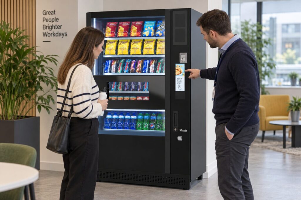
The purpose is to make an ordinary purchase easier to follow. A notice cannot compensate for an unsuitable layout or a broken control, and it should not describe features the equipment does not have. Work with the operator to keep the message accurate.
Follow the real purchase sequence
Observe an authorised demonstration from product choice through payment to collection. Record the steps in the order required by this configuration. Do not copy instructions from another model, even if the cabinets look similar or use the same payment provider.
Keep each step focused on one action. Where the machine gives a prompt, use wording that helps the customer recognise it rather than inventing a new term. If different payment methods follow different steps, ask the operator how to explain that distinction without crowding the main notice.
Use pictures to identify, not decorate
A simple picture can help show the relevant selection area or collection opening. It should clearly relate to the actual machine, with enough context that customers can locate the part. Avoid a generic vending icon that does not explain the action being described.
Check that arrows or labels do not point to the wrong control. Our guide to selection numbers and product matching covers one common source of confusion. Pictures should support the written instruction, not contradict the visible identifiers or encourage customers to reach into unsuitable areas.
Keep the language direct
Use familiar words and short sentences. Avoid internal operator terms that a customer has no reason to know. If the workplace needs translated instructions, have the wording checked appropriately and ensure that every version describes the same current process.
Do not assume that adding many languages to one small sign makes it easier to read. Consider the available space and the audience with the site contact. Keep essential steps visible at the point of use and provide a clear assistance route for anyone who still needs help.
Test with a first-time user
Ask a willing colleague unfamiliar with the machine to explain what they think the instructions mean. Observe where they hesitate during an agreed demonstration, without collecting unnecessary personal information or making them feel examined. The test is of the notice, not the person’s ability.
Change the unclear part and test it again. If people repeatedly struggle at the same stage despite clear wording, discuss the equipment setup or customer journey with the operator. Do not keep adding instructions to explain around a fault or a poorly chosen physical position.
Maintain the notice when the setup changes
Assign responsibility for checking instructions after changes to payment equipment, product identifiers or the purchase process. An old sign beside a new configuration can create avoidable mistakes. Keep the approved version accessible so temporary replacements do not introduce contradictory wording.
Include customer guidance when considering vending equipment for your site. A useful notice should help people choose, pay, collect and find assistance confidently. It should remain concise enough to read during a normal purchase, with accurate pictures and a support route that the site actually maintains.
To discuss a suitable customer journey, contact the team with the machine arrangement and the needs of your users.