
Visitor Vending Signs: Help People Find, Use and Report a Problem
A visitor may pass a vending machine without knowing whether it is available to them or how to get help if a purchase fails. Clear information can reduce that uncertainty. Plan the signs around the visitor’s journey rather than filling every available surface with messages.
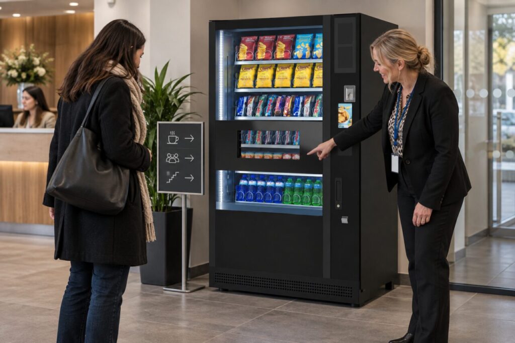
Use the actual service arrangement as the reference. A sign should not promise free products, unrestricted access or a particular payment option unless those statements are correct for the equipment and location.
Separate directions from operating instructions
A direction sign helps a visitor find the machine. The machine’s own instructions explain how to use it. Keep those purposes distinct so a corridor notice does not try to reproduce a complicated payment sequence that may later change.
Use plain language and an unambiguous location description. Check the route from the entrance a visitor normally uses, not only from the staff office. Ask someone unfamiliar with the building to follow the direction and explain where they became uncertain.
Clarify who can use the service
If the machine is in a restricted area, explain the authorised access arrangement through the site team. Do not direct visitors through staff-only doors or imply that reception can always provide access. Check how the arrangement works outside normal reception hours if the venue is open then.
Where staff and visitors have different funding arrangements, keep the explanation accurate and discreet. A general sign should not expose employee access details or suggest that a staff benefit automatically applies to every visitor. Ask the responsible provider how customer instructions should be presented.
Keep the product and payment area readable
Do not cover the product display, controls or collection opening with extra notices. Position approved information where it can be read without interfering with normal use. Any attachment to the cabinet should follow the supplier’s guidance rather than an improvised approach.
Review the wording against the installed configuration. Avoid a universal instruction such as tap first if that is not the approved sequence. Our demonstration guide encourages following the whole customer journey to identify unclear steps.
Give one clear support route
Identify the responsible contact for a purchase problem and the basic information that helps them respond. The site location, approximate time and a short description are usually more useful starting points than a visitor attempting a technical diagnosis.
Keep private account information out of the public notice. If the provider uses a specific support reference, confirm the correct wording with them. Avoid placing several conflicting phone numbers beside each other without explaining their purpose, especially if one belongs to a former supplier.
Maintain the signs after changes
Assign someone to review signs when equipment, providers or access arrangements change. Remove obsolete notices from the active customer area so a visitor is not asked to choose between different instructions. Date the internal review record rather than cluttering the public sign with administrative detail.
Observe the service after the change. If visitors still ask reception where to collect a product or how to report an issue, identify the particular gap. The answer may be a clearer location or shorter sentence rather than a larger amount of text.
Discuss the setting when choosing vending machines. Equipment, location and customer information work together; a good cabinet cannot compensate for a visitor being directed to the wrong room.
Ask our team to clarify the appropriate customer and support information for your planned service.